
The End of !important Wars: CSS Cascade Layers for Design System Architecture
If you've ever opened a legacy stylesheet and felt genuine fear at the sight of !important sprinkled across three different files, cascade layers are your escape route. The @layer at-rule, now supported across all major browsers, gives you explicit control over specificity hierarchy without sacrificing the cascade itself.
This isn't about another CSS gimmick. It's about architectural clarity for teams shipping complex design systems where third-party libraries, component libraries, and utility classes constantly collide.
Why Specificity Breaks Design Systems
Every frontend team hits the same wall eventually. You start with clean styles, someone adds a quick override, then a library introduces its own defaults, and suddenly you're debugging why .btn-primary renders blue in one context and green in another. The culprit is always the same: specificity chaos.
The traditional fixes are ugly. You increase selector depth until you win the specificity lottery, or you deploy !important like a tactical nuke. Both approaches create technical debt that compounds over time. Cascade layers solve this by letting you declare priority before you write a single selector.
How @layer Works
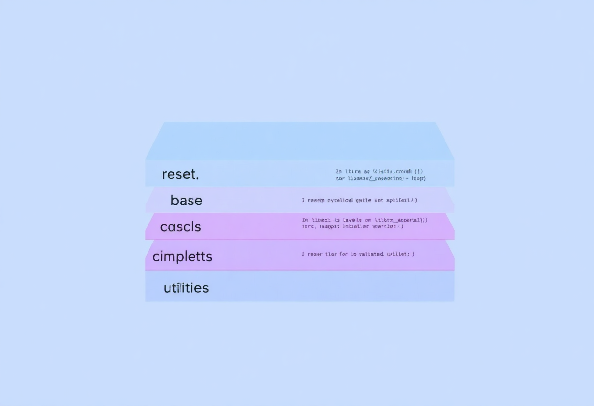
The concept is elegant in its simplicity. You define layers in order of priority, and that order becomes immutable. Rules in earlier layers always lose to rules in later layers, regardless of selector specificity. Here's the basic declaration:
@layer reset, base, components, utilities;This single line establishes your design system's cascade architecture. A rule in utilities will override the same property in components, which overrides base, which overrides reset. No !important needed.
Then you populate each layer:
@layer reset {
  * {
    box-sizing: border-box;
    margin: 0;
  }
}

@layer components {
  .btn {
    padding: 0.75rem 1.5rem;
    border-radius: 0.375rem;
  }
}

@layer utilities {
  .text-center {
    text-align: center;
  }
}
Production Patterns for Real Teams
The theory is straightforward; the practice requires discipline. Here are patterns that work in production environments.
Pattern 1: Third-Party Library Isolation
When you integrate a UI library or a charting component, its styles often leak into your design system. Instead of fighting specificity battles, wrap the third-party CSS in its own layer:
@layer third-party {
  /* Imported chart.js or datepicker styles */
}
Place this layer before your design system layers so your styles always win. You can import third-party CSS directly into a layer using @import:
@import url('datepicker.css') layer(third-party);This is cleaner than prefixing every third-party selector or using Shadow DOM for components that don't support it.
Pattern 2: Theme-Aware Overrides
Design systems with multiple themes (light/dark, brand variants) benefit from a dedicated theme layer. Place it after your component layer so theme tokens override default component colors:
@layer reset, base, components, themes;

@layer components {
  .card {
    background: var(--card-bg, #ffffff);
    color: var(--text-primary, #1a1a1a);
  }
}

@layer themes {
  :root[data-theme="dark"] {
    --card-bg: #1e1e1e;
    --text-primary: #e0e0e0;
  }
}
The layer ordering guarantees theme variables cascade correctly without requiring complex selector targeting.
Pattern 3: Progressive Enhancement with Anonymous Layers
Not every stylesheet needs explicit layering. Unlayered rules go into anonymous layers that sit between named layers, maintaining backward compatibility. This lets you incrementally adopt cascade layers without rewriting your entire codebase.
Start by layering your reset and utilities, then gradually add layers for components and themes as you refactor. The anonymous layer behavior ensures old styles still participate in the cascade predictably.
Common Pitfalls to Avoid
Cascade layers are powerful but not magic. Here's what trips teams up.
Over-engineering the layer hierarchy. Four to six layers is usually sufficient. If you're defining twelve layers, you're adding cognitive overhead without proportional benefit. The goal is clarity, not bureaucratic granularity.
Forgetting that specificity still matters within a layer. Layers only determine priority between layers. Inside a single layer, normal specificity rules apply. A .btn.primary selector still beats .btn within the same layer.
Mixing @layer with @import without care. When you import CSS into a layer, all rules in that file inherit the layer's priority. Importing a poorly structured third-party stylesheet into a high-priority layer can cause unexpected overrides. Always inspect what you're importing.
When to Skip Cascade Layers
Cascade layers shine in medium-to-large codebases with multiple style sources. If you're shipping a simple marketing site with fifty lines of CSS, you don't need them yet. They're an architectural tool for complexity, not a requirement for every project.
Similarly, if your team is still struggling with basic CSS fundamentals, adding layering on top might create confusion rather than clarity. Master the cascade first, then use layers to control it.
The Bottom Line
CSS cascade layers represent one of the most practical modern CSS features for production teams. They don't change how you write selectors or design components. They give you a way to declare intent about which styles should win, making your stylesheet architecture explicit instead of implicit.
For design system maintainers, that's the difference between debugging specificity wars at 2 AM and knowing exactly where to look when something renders wrong. It's not flashy, but it's the kind of tooling that separates sustainable codebases from fragile ones.



Comments